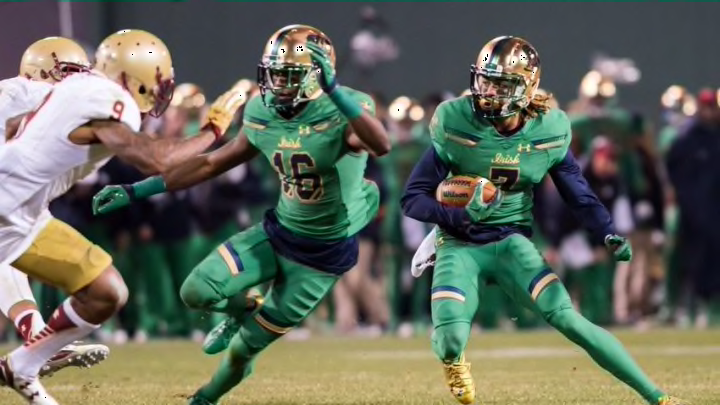
2011 vs. Maryland
When Maryland debuted its “Pride” uniforms in 2011, they were widely ridiculed as a ridiculous mishmash of the state flag, with the yellow-and-black checkered side drawing comparisons to a crash test dummy.
I personally didn’t think the Maryland jerseys were all that bad, though I can certainly understand people’s scorn if they’re not familiar with Marylanders’ obsession with their state flag. What I can’t understand is whatever the heck is going on with Notre Dame’s attire in this game.
The helmet had what is apparently called a foil pattern, with the overall effect being something like a golden golf ball. That gold also made the gold in the jersey look pale and washed out.
And let’s talk about that shamrock on the helmet. adidas gets some bonus points for, you know, using a shamrock in something called the Shamrock Series, but wow is that thing oversized, and like the rest of helmet, the color doesn’t match the green on the uniform.
Bottom line, you gotta pick one shade and stick with it throughout. Otherwise it just looks like you can’t distinguish between them.
Next: The current iteration
