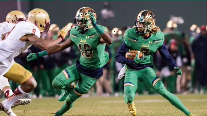
Notre Dame Football: Ranking all the Shamrock Series uniforms
By Greg Hadley

You've seen the #ShamrockSeries uniform — now take a closer look at the details. pic.twitter.com/9CNsD9M5wm
— Notre Dame Football (@NDFootball) July 22, 2016
2016 vs. Army
It’s a little hard to judge this one before we see it on the field, but the first impression is not good. Rather than go with camo, Under Armour instead tried to be subtle by using duskier versions of green and gold for a camo-like feel. The result is just kind of meh.
The whole point of camo is that it’s supposed to blend in, and that’s what, on first glance, this jersey does: blend in to the field and fail to stand out.
That’s a shame, because although there’s something off about the big picture, the details on this thing (see above) are fantastic. Drawing inspiration from the Basilica and the famous “God, Country, Notre Dame” frieze, the shoulder pads and font of “Notre Dame” on the front of the jersey are spot-on. But unless you’re standing five feet away, you won’t see them.
Up close: Hand painted Notre Dame helmets for "Shamrock Series" game pic.twitter.com/yJrAhkEJMW
— Darren Rovell (@darrenrovell) July 21, 2016
As for the helmet, the same critiques apply: great up close, but from the stands or in a wide-angle view on TV, it’ll just look like a slightly discolored gold helmet that doesn’t match the dull-colored uniform.
Next: Dear lord, that helmet