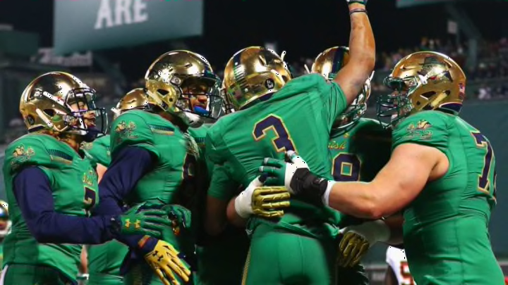
No. 8: 2012 vs. Miami (Soldier Field, Chicago, IL)
In 2011, the Irish dipped their toe in the water and experimented with some new helmets. In 2012, they dove in head first and unveiled completely new full uniforms.
In what was a magical football season (minus the BCS National Championship game), these were one of the few lowlights. Right down there with that triple overtime Pittsburgh game.
The jerseys on their own looked fine. They were navy blue and had gold numbers with white outlines.
The helmets and the pants are the pieces of this ensemble that dragged these uniforms to the bottom of my rankings.
The gold section of the helmets had a wave effect painted on them, which was similar to what we saw the previous year. A section on the left side of the helmet was painted black with a white outline of the leprechaun logo. The line dividing the two sections of the helmet was intentionally off-center and it looked a bit odd.
To match the helmets, the gold pants also had a dark stripe running down the left side with a white leprechaun logo on them.
The idea of making the uniform look different from two sides sounds good and artistic in theory. However, the final product looked a bit odd and left a lot to be desired.
